Clustering Baltimore Crime Data
Baltimore crime data was clustered based on police districts. Geographical data was visualized using Cartopy and Open Street Maps. Coded in Python.
This project makes use of Scikit-Learn’s clustering methods in order to cluster crime data.
Data was obtained from the Baltimore Sun: https://www.baltimoresun.com/news/crime/bal-police-codes-box-story.html. It represents crimes reported in the Baltimore area between 1960 and November 2020. Many factors are reported for each crime, but the ones that were primarily used in this project were latitude, longitude, and police post (a subdivision of the police district).
Additionally, weather data was combined with the crime data in an attempt to relate the two. The weather data was obtained from this site: https://towardsdatascience.com/obtain-historical-weather-forecast-data-in-csv-format-using-python-5a6c090fc828
Visualizing the Raw Data
First, the datasets were cleaned and combined in order to remove all NA values, and the year was limited to 2014-2020 because of the number of entries in the dataset. If the data was to be represented on a map of Baltimore, it would get cluttered very quickly. Instead, the data is better represented as a frequency plot:
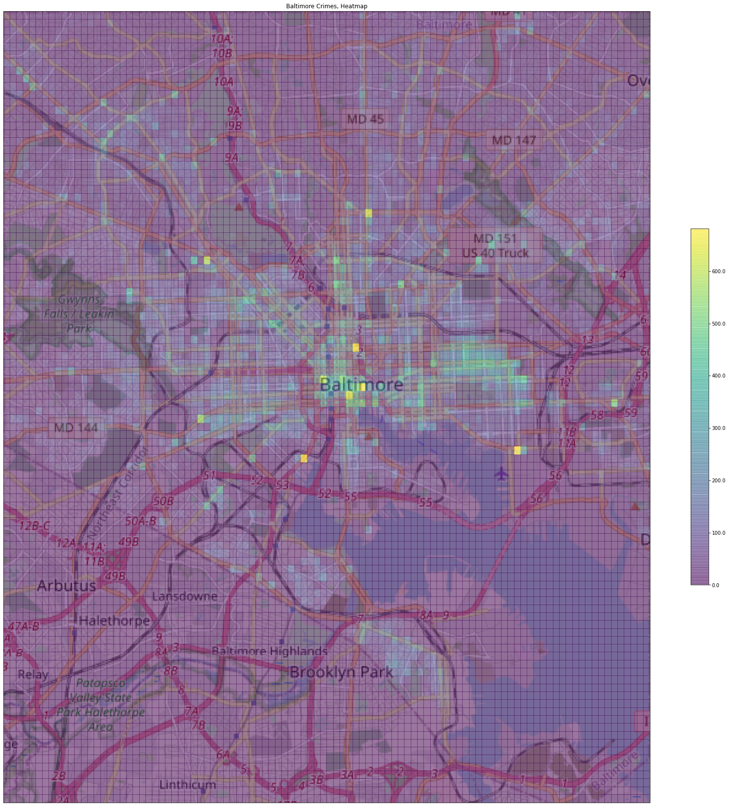
Above is a heatmap of crimes committed in the Baltimore area. This heatmap is a 2-dimensional histogram of crimes committed in a location given by latitude and longitude, and is overlaid on a map of Balitmore to visually represent the areas where crimes were most committed. The highest volume of crimes are committed in the downtown area at the heart of Baltimore and a likely explanation is that this is the largest urban center in the area and is therefore densely populated. Another crime hotspot appears to be the area surrounding the park to the east of downtown Baltimore.
The map was plotted using the Cartopy package, which sourced the background tile from Open Street Maps. Crime latitudes and longitudes were transformed using a geodetic coordinate system (necessary in this case to match the coordinate system of the map) and then plotted on top of the map using Matplotlib.
Crime Frequency Heatmap Code
#initialize the figure
fig = plt.figure(figsize=(30,30))
#call cartopy's embedded open street maps function
imagery = OSM()
#define the axes and limit the size of the map in latitude/longitude
ax = plt.axes(projection=imagery.crs, )
ax.set_extent(( -76.80, -76.4, 39.1, 39.4))

#plot the map on the axes
zoom = 12
ax.add_image(imagery, zoom)


# do coordinate conversion of (x,y)
xynps = ax.projection.transform_points(ccrs.Geodetic(), crimelong, crimelat)
# make a 2D histogram (frequency heatmap)
h = ax.hist2d(xynps[:,0], xynps[:,1], bins=100, alpha=0.5)

#add a title
plt.title('Baltimore Crimes, Heatmap')
#add a color bar (legend)
cbar = plt.colorbar(h[3], ax=ax, shrink=0.45, format='%.1f')
#show the plot
plt.show()
The map was first plotted on the axes and then a heatmap (or 2-dimensional histogram) was overlaid on top. Of particular note, the data had to be transformed using a geodetic datum in order for data to appear on the map.
Clustering: Police Post
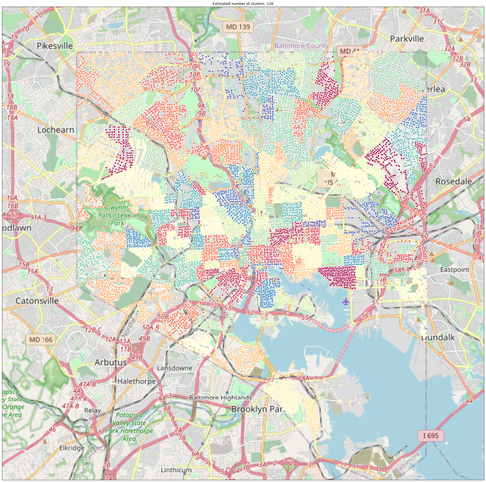
Baltimore is divided up into 126 police posts. Crimes in the dataset included the police post they occurred in, so the point of this exercise is two-fold: to demonstrate that the clustering algorithm can re-construct Baltimore’s police posts based on raw data, and to tune the hyperparameters related to the model.
As the above graph shows, the clustering algorithm was able to re-create all 126 police posts. This was expected, since post is given as a clustering variable. Observe that the clusters tend to be bounded by roads, which is also how police posts are defined. Though the example is simple, is worth noting that this same method can be applied to another scenario such as clustering movies based on rating from 1 to 5.
Modeling
#initialize parameters: minimum number of points per cluster and cluster radius
X3_minpts = 20
X3_eps = 0.02

#call Scikit-Learn's DBSCAN method to cluster the points, X3=dataframe
db = DBSCAN(eps=df_eps, min_samples=df_minpts).fit(X3)
labels = db.labels_

#calculate the number of clusters: number of labels minus the noise label if present
n_clusters_ = len(set(labels)) - (1 if -1 in labels else 0)

#Determine which samples are "core" samples
core_samples_mask = np.zeros_like(db.labels_, dtype=bool)
core_samples_mask[db.core_sample_indices_] = True
The DBSCAN method was used to cluster all of the points based on latitude, longitude, and police posts. Prior to fitting the model, the minimum number of points per cluster and the clustering radius had to be specified. Though it is not explicitly shown in this notebook, these parameters were tuned by trial-and-error until acceptable results were achieved by the model.
Visualize Results
#initialize figure
plt.figure(figsize=(10,10))
#get the list of labels
unique_labels = set(labels)
#generate a list of unique colors as long as the list of labels
colors = plt.cm.Spectral(np.linspace(0, 1, len(unique_labels)))

#step through each label and color
for k, col in zip(unique_labels, colors):
    if k == -1:
        #Set the color for noise to black
        col = 'k'

#set the iteration class mask
    class_member_mask = (labels == k)

#Deal with all core points
    xy = X3[class_member_mask & core_samples_mask]
    #plot the core points
    plt.plot(xy.iloc[:, 0], xy.iloc[:, 1], 'o', markerfacecolor=col,
             markeredgecolor='w', markersize=6)

#Deal with all noise points
    #plot the rest of the points
    xy = X3[class_member_mask & ~core_samples_mask]
    plt.plot(xy.iloc[:, 0], xy.iloc[:, 1], 'o', markerfacecolor=col,
             markeredgecolor='w', markersize=3)

#Set the title and grid
plt.title('Estimated number of clusters: %d' % n_clusters_)
plt.grid()
plt.show()
The above code re-creates the graph shown at the beginning of this section. The code automatically uses the first two columns in the dataframe as the axes variables. It gives each cluster a unique color, and colors the noise points black.
Verify Results
X3_w_labels = copy.deepcopy(X3)
X3_w_labels['cluster_id'] = db.labels_
X3_w_labels.groupby('cluster_id').std()['Post'].sort_values()
cluster_id
0      0.0
91     0.0
90     0.0
89     0.0
88     0.0
      ...
35     0.0
34     0.0
33     0.0
46     0.0
125    0.0
Name: Post, Length: 126, dtype: float64
As a validation step, the standard deviation of “Post” is calculated for the observations within each cluster. This returns the standard deviation for the “Post” variable for each cluster. If the standard deviation of a cluster is equal to zero, that means that all the points in that cluster have the same “Post” value. Values are sorted, which indicates that all standard deviations are equal to zero, indicating that the model correctly classified all points.
silhouette_score(X3.sample(10000, random_state=12345), X3_w_labels['cluster_id'].sample(10000, random_state=12345), metric = 'euclidean')
0.9933050301880157
The silhouette score for this set of clusters is nearly 1. This indicates extremely good clustering with clusters that show strong and clear separation from other clusters, and also that points are close to one another within each cluster. Silhouette scores can range from 1 to -1. The silhouette score is designed such that 1 is the best possible score, -1 is the worst possible score, and values near 0 indicate overlapping clusters. Values near 1 indicate that clusters do not overlap and that points are dissimilar from other clusters. Values near -1 indicate that clusters do not overlap, but that points are more similar to other clusters.
Clustering: Police District

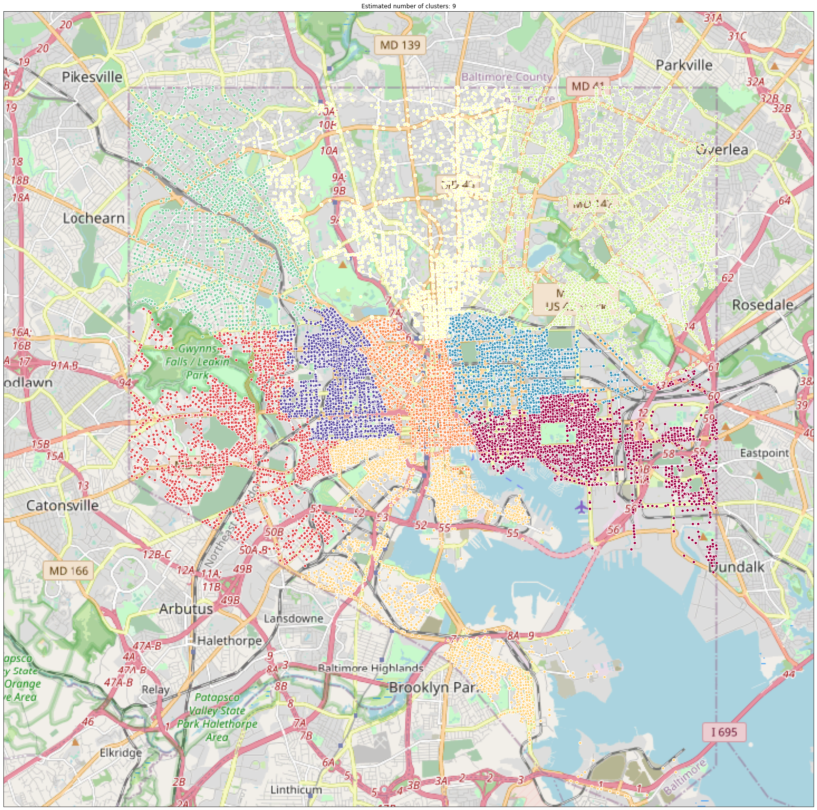
Clustering algorithms were run to see if Baltimore’s 9 police districts could be reconstructed from police post information. This information was given as a variable in the raw data, but was not given to the clustering algorithm. Note the color difference between the North and Northeast districts, and compare the above graph to the map below.
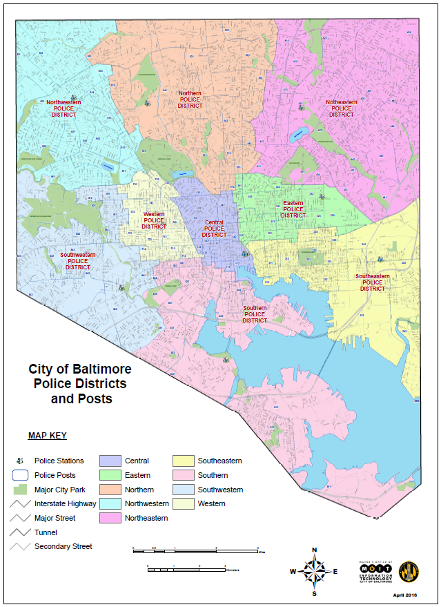
Visually the clustering algorithm was successful in recreating Baltimore’s police districts based on the police post and location data for crimes committed between 2014 and 2020.
Modeling and Visualization
Modeling and visualization code was the same as above, except that the minimum number of points was set to 40 and the clustering radius was set to 10. These values had to be much bigger than the police post values because police districts cover a much larger area.
Verify Results
#copy the input data
X3_w_labels = copy.deepcopy(X3)
#add the cluster labels to the dataframe as determined by the algorithm
X3_w_labels['cluster_id'] = db.labels_

#one-hot encode the districts
x3_dummies = pd.get_dummies(df['District']).reset_index()
#merge the one-hot encoded data with the dataset that now also contains the cluster labels, to create one large dataframe
X3_w_labels = pd.merge(X3_w_labels, x3_dummies, how='inner', left_index=True, right_index=True)

#set the number of decimals to be large
pd.set_option("display.precision", 8)
#find the standard deviation of
X3_w_labels.groupby('cluster_id').std()
| crimelong | crimelat | Post | index | CENTRAL | EASTERN | NORTHEAST | NORTHERN | NORTHWEST | SOUTHEAST | SOUTHERN | SOUTHWEST | WESTERN | ||
|---|---|---|---|---|---|---|---|---|---|---|---|---|---|---|
| cluster_id | ||||||||||||||
| 0 | 0.01977878 | 0.00690827 | 3.29795098 | 80088.62444110 | 0.0 | 0.0 | 0.0 | 0.0 | 0.0 | 0.0 | 0.0 | 0.0 | 0.0 | |
| 1 | 0.01617222 | 0.01425231 | 3.29606246 | 81422.84535545 | 0.0 | 0.0 | 0.0 | 0.0 | 0.0 | 0.0 | 0.0 | 0.0 | 0.0 | |
| 2 | 0.00803785 | 0.00848922 | 3.27283914 | 80300.32216347 | 0.0 | 0.0 | 0.0 | 0.0 | 0.0 | 0.0 | 0.0 | 0.0 | 0.0 | |
| 3 | 0.01834790 | 0.02011592 | 3.31915894 | 83568.46481895 | 0.0 | 0.0 | 0.0 | 0.0 | 0.0 | 0.0 | 0.0 | 0.0 | 0.0 | |
| 4 | 0.01740861 | 0.01590656 | 3.28587408 | 82685.48362709 | 0.0 | 0.0 | 0.0 | 0.0 | 0.0 | 0.0 | 0.0 | 0.0 | 0.0 | |
| 5 | 0.01985762 | 0.01780821 | 3.29627652 | 82536.05866798 | 0.0 | 0.0 | 0.0 | 0.0 | 0.0 | 0.0 | 0.0 | 0.0 | 0.0 | |
| 6 | 0.01505976 | 0.01469923 | 3.27455490 | 82601.02729378 | 0.0 | 0.0 | 0.0 | 0.0 | 0.0 | 0.0 | 0.0 | 0.0 | 0.0 | |
| 7 | 0.01306808 | 0.00650235 | 3.26240335 | 80652.46272494 | 0.0 | 0.0 | 0.0 | 0.0 | 0.0 | 0.0 | 0.0 | 0.0 | 0.0 | |
| 8 | 0.00764339 | 0.00945660 | 3.17560861 | 81746.90865643 | 0.0 | 0.0 | 0.0 | 0.0 | 0.0 | 0.0 | 0.0 | 0.0 | 0.0 |
Because district data was not given to the clustering algorithm, it was able to be used as test data to score the model. In the same way as the first model, the standard deviation of each cluster was calculated. The table of zeroes indicates that the model was able to perfectly recreate police districts based on latitude, longitude, and police post of reported crimes between 2014 and 2020, because all points in each cluster share the same district.
silhouette_score(X3.sample(10000, random_state=12345), X3_w_labels['cluster_id'].sample(10000, random_state=12345), metric = 'euclidean')
0.8771542608117968
The silhouette score for this set is at 87.7%. This indicates a very good clustering with clusters that are very unrelated to other clusters, and also that points are close to one another within the cluster. Clusters show clear separation but the borders are fuzzier than the previous example.
Clustering: Hours of Sun Per Day
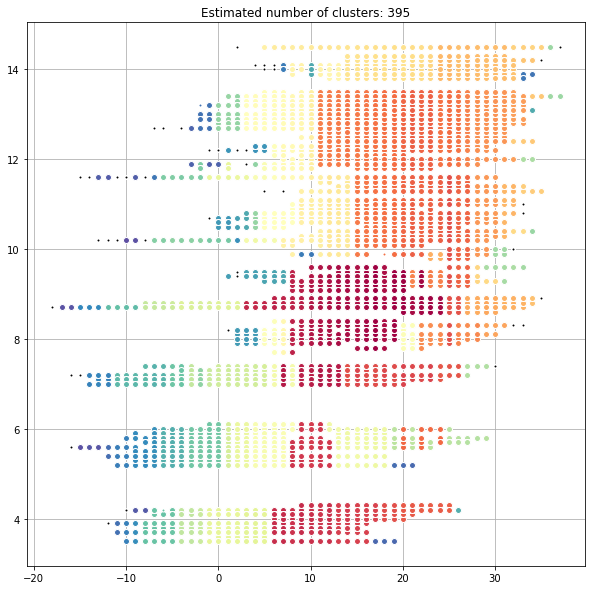
Attempts were made to relate weather data to reported crimes. The above crime data is clustered based on latitude, longitude, temperature at the time the crime was committed, and the number of hours of sunlight that Baltimore received that day. The data was plotted in such a way in order to clearly show the cluster groupings. Choosing the dimensions along which the data is viewed is important; as is shown below the clusters do not map as cleanly to latitude and longitude.
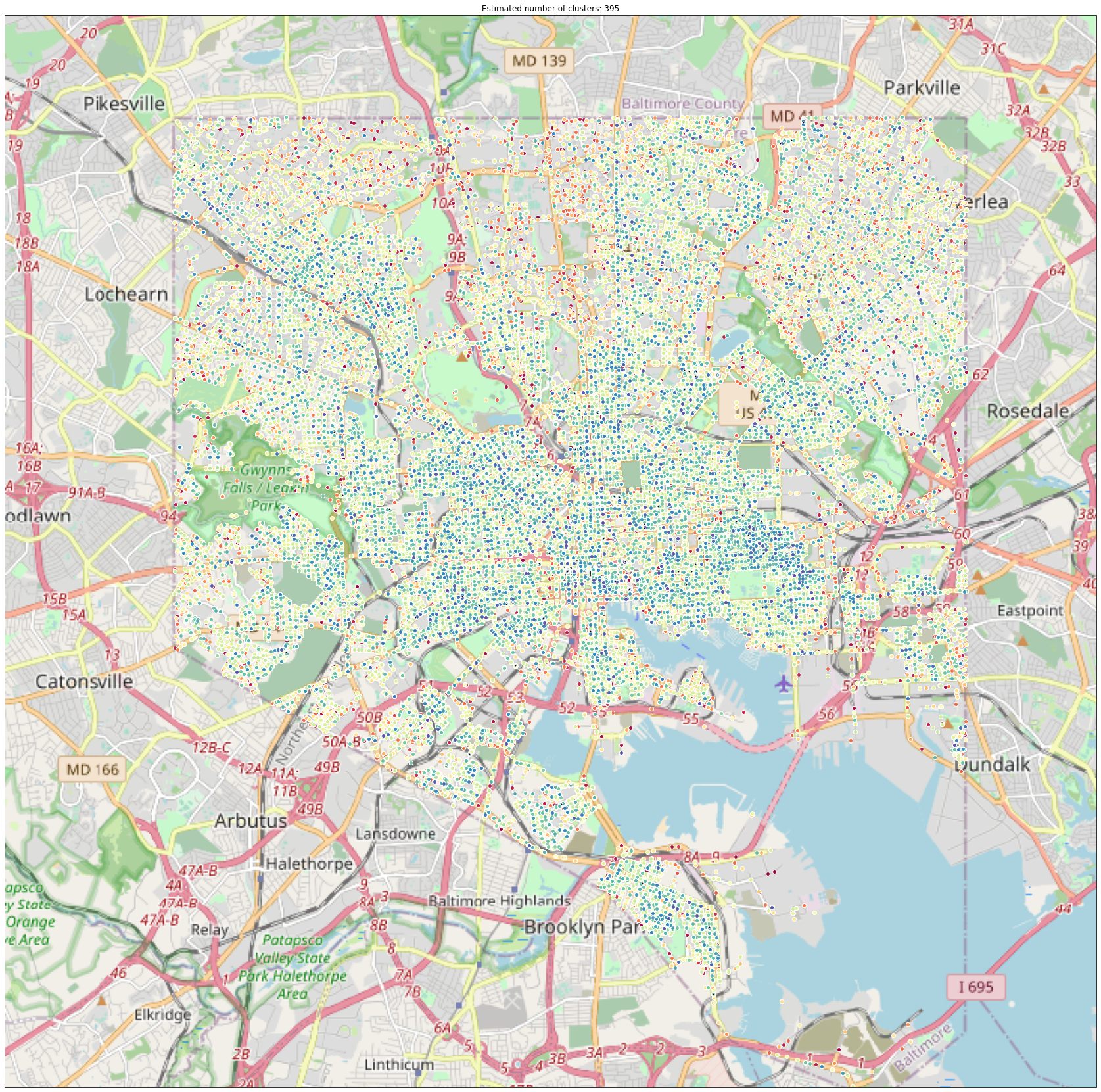
Above is a graph of the same data, but laid out by latitude and longitude. As this plot shows, the clusters are not geographically cohesive. Noise data is also more visually represented in this plot, and seems to occur with more frequency within downtown Baltimore.
Practical application of the model would look like this: the temperature and projected hours of sunlight for a given time and day could be plotted and clustered on the first graph (or rather, on the two dimensions represented therein); this would then determine the likely latitudes and longitudes where a crime would be committed given those weather conditions. Because of the number of significant digits given in the latitude and longitude data, likely criminal activity could be predicted to a neighborhood or even to a city block with further tuning. Adding the “Description” variable to the model could additionally allow one to predict the type of crime likely to occur.
Modeling and Visualization
Modeling and visualization code is very similar to the first example. The minimum points per cluster was set to 10, and the clustering radius was set to 0.3.
Verify Results
silhouette_score(X3.sample(10000, random_state=12345), X3_w_labels['cluster_id'].sample(10000, random_state=12345), metric = 'euclidean')
0.6322616663393303
Finally, the silhouette score for this set of clusters is around 63.2%. This indicates a decent fit, where most points tend to be accurately classified. Additionally, clusters do not tend to overlap.