Presentation Re-Design
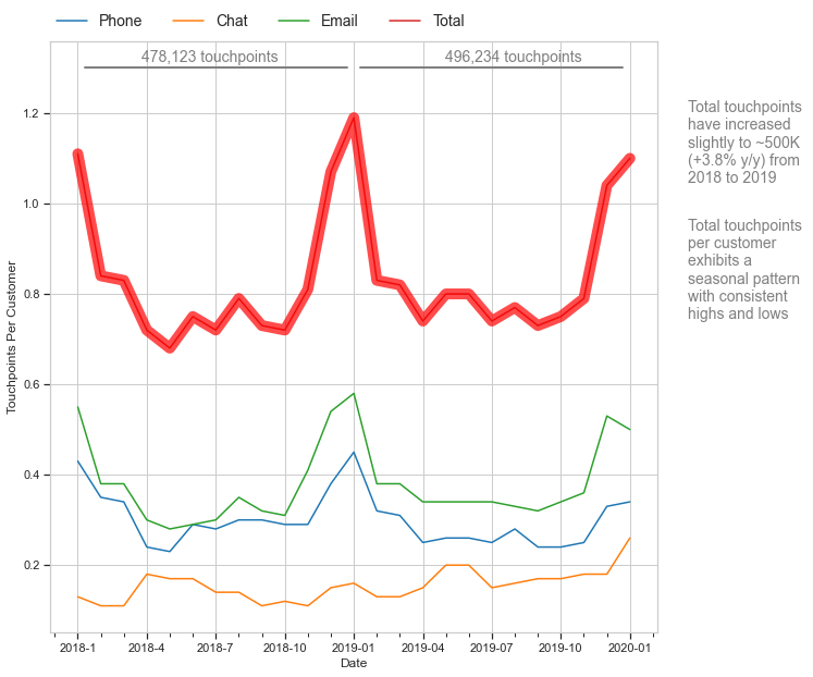
This graph is the result of re-designing a slide from a presentation.

As part of our visualization course we were tasked with critiquing and re-designing a slide from a presentation on customer touchpoints. This article will first show a critique of the original slide followed by the redesign. Finally, the code to generate the redesign will be shown and explained.
The Original Slide

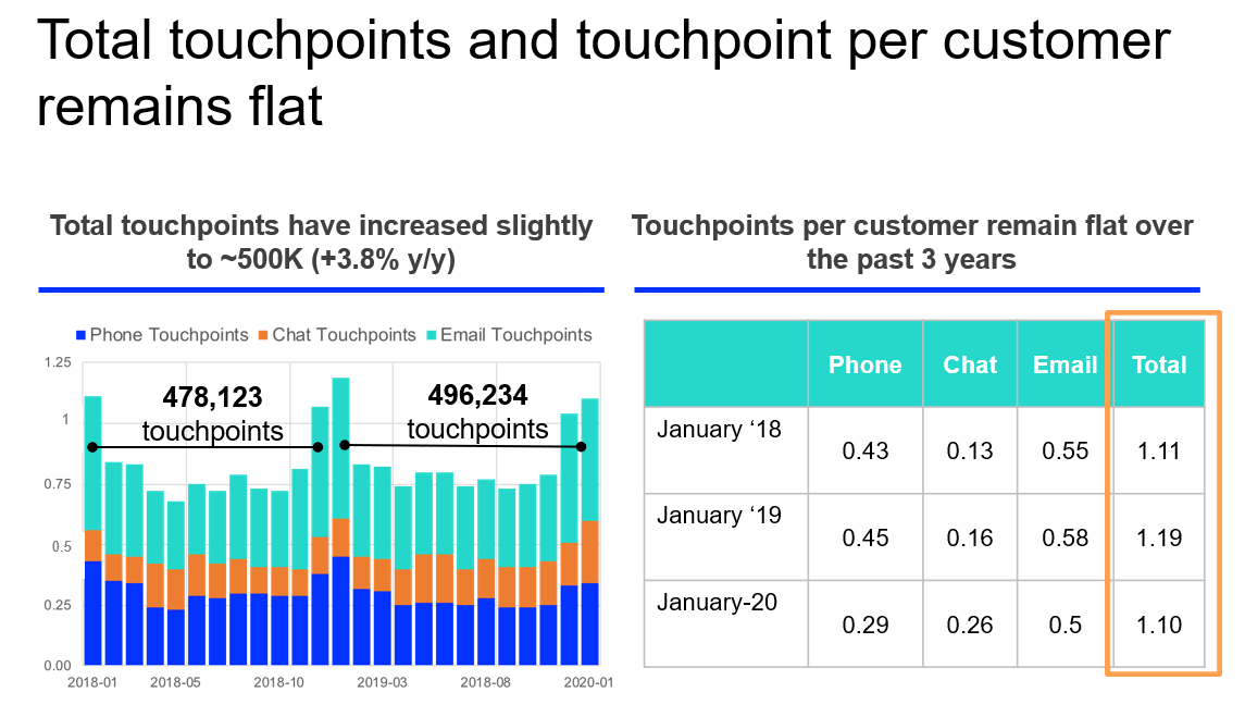
This is the original slide. There is a lot to unpack here.
The slide is composed of a title and two panels showing a stacked bar chart and a table of numbers. Above each panel is a text box displaying the overall takeaway of each panel.
I usually find two-panel layouts to be cool and informative, but in this case the two panels combine to make the slide busy and visually convoluted. The text over each panel is having an identity crisis; it could be construed as either a title or as an annotation (for the sake of simplification I will refer to them as titles). Where the graph titles are center aligned, the slide title is left aligned. This is unsettling.
The stacked bar chart takes data and forces it into a format where each data source is displayed relative to each other data source. As a result, phone touchpoints (in blue) are the only source where the viewer can correctly determine the trend. All sources of data appear to follow a seasonal pattern, including chat touchpoints (more on this later). Notice also that there is an error on the x-axis where a year is incorrectly labeled as 2018 instead of 2019. There are two bars bisecting the graph showing touchpoint totals for the past two years, which is a feature that I like about the graph. The creator must have liked that feature also, because the title refers to these lines instead of referring to the meat of the visualized data.
The table on the right is scary and impossible to read. When my eyes glance over it, I don’t even see the numbers. My vision clouds over as if my brain is blur-censoring the panel. This table makes the viewer work hard to glean usable information. There is an orange box highlighting the total column, so that gives us a hint as to what the original creator wanted the viewer to find important about this panel. The use of this box to highlight a portion of the panel is good, however the box is not fitted to the column! This adds to the alignment nightmare created by the graph and slide titles. The X and Y axis labels are missing and the viewer must guess the nature of the data being represented; the Y axis scale represents touchpoints per customer and not percentages. Notice also the row labels: the data for this table is taken from the month of January for each year, which means that the title of this panel is misleading and conflicts with the stacked bar chart: touchpoints do not remain flat, and the data only displays the past two years. January-20 does not match the format of January ‘19 or January ‘18, there is only a single significant digit in the final “Email” row, and the viewer is very likely to miss the drastic drop in phone touchpoints and increase in chat touchpoints.
This slide can be presented in a visually pleasing manner that is easier to read and conveys all of the information presented in this slide.
The End Product

This is the redesigned slide. All of the information presented in the original slide is presented in this graph. Total touchpoints are present on the graph and highlighted in bold red. Yearly touchpoint totals are present at the top, much like they were in the original slide. The panel titles have been turned into annotations and given their own space on the right side of the graph, and the “remained flat” dross from the original slide has been updated to reflect the seasonal nature of the data. The X and Y axes are labeled so that the viewer is not guessing what the data is supposed to represent. Most importantly, the touchpoint sources are visually independent from each other; this allows the viewer to see that where phone and email touchpoints follow the seasonal trend (and phone values are down from the past two years), chat touchpoints have actually been steadily increasing in value over the past two years. This reflects the increasingly digital society that we live in.
Code Walkthrough
Importing Packages and Cleaning Data
import pandas as pd
import numpy as np
import matplotlib as mpl
import matplotlib.pyplot as plt
from matplotlib.ticker import MultipleLocator
import seaborn as sns
As always, I start with the import block. Pandas and Numpy are almost a basic requirement. Seaborn is also imported here but Matplotlib is the real star of the show. Note the names that these modules are imported as.
df = pd.read_csv("./Data/touchpoints.csv", skipinitialspace=True)
df['id'] = df.index
l = pd.wide_to_long(df, stubnames='Touchpoints', i=['id', 'Date'], j='Source', suffix='\D+')
Above, the dataframe is imported from the .csv file. It was also necessary to convert the dataframe from wide to long format, so I did this with the Pandas method wide_to_long(). Interestingly, it was also necessary to keep the dataframe in wide format in order to plot all of the data easily. When the data is converted to long format, an additional column titled “Source” is added, and each row is labeled with the touchpoint source in question (phone, email, chat, or total).
Creating the Graph
First I will go over each line of code, and then I will post all of the code in a single code block at the end.
#adjust preliminary graph settings: theme and plot size
sns.set_theme(style="whitegrid", rc={"xtick.bottom" : True, "ytick.left" : True})
plt.figure(figsize=(10,10))
Before the graph can be created, the seaborn theme and plot size must first be specified. Within sns.set_theme, the parameter “rc” specifies that X and Y minor ticks are turned on. The size of the graph is specified by plt.figure().
This being set first does not reflect how I actually create graphs; usually I start by generating the graph then find after the fact that it is necessary to set the theme and graph size first.
#create the base plot and set the labels
plot =  sns.lineplot(data=l, x='Date', y='Touchpoints', palette="tab10", hue='Source', linewidth=1.5)
plot.set(xlabel="Date", ylabel='Touchpoints Per Customer')
Next, the base plot is created with seaborn. This method grabs the data from the long format dataframe and plots it according to the value in the Source column. This is the only seaborn call and the rest of the graph formatting is done in matplotlib. Beneath this line, the X and Y axis labels are set.
#adjust major and minor tick marks on the x axis
plot.xaxis.set_major_locator(MultipleLocator(3))
plot.tick_params(axis='x', which='minor', direction='out')
plot.xaxis.set_minor_locator(MultipleLocator(1))
Major and minor tick marks are then adjusted for the x axis. The major tick marks are specified for intervals of 3 with MultipleLocator(). The minor tick marks are then specified to go out from the axis at intervals of 1.
#put the legend above the plot
plot.legend(loc='lower left', bbox_to_anchor= (0.0, 1.01), ncol=4,
            borderaxespad=0, frameon=False, fontsize=14)
The legend is placed above the plot. The loc parameter specifies that the legend will be placed according to the lower-left corner of the bounding box, which is anchored using the coordinates in bbox_to_anchor(). The number of columns in the legend is set to 4 with ncol, which causes the legend to have only a single row. Spaces between columns are set to 0 with borderaxespad, which gives the default spacing. The font size is specified with fontsize, and frameon is set to false which causes the frame around the plot canvas to be transparent.
#put some annotations on the graph
plot.annotate('Total touchpoints \nhave increased \nslightly to ~500K \n(+3.8% y/y) from \n2018 to 2019',
            xy=(3, 1),  xycoords='data', fontsize=14,
            xytext=(1.05, 0.9), textcoords='axes fraction',
            horizontalalignment='left', verticalalignment='top', color='grey'
            )
plot.annotate('Total touchpoints \nper customer \nexhibits a \nseasonal pattern \nwith consistent \nhighs and lows',
            xy=(3, 1),  xycoords='data', fontsize=14,
            xytext=(1.05, 0.7), textcoords='axes fraction',
            horizontalalignment='left', verticalalignment='top', color='grey'
            )
The above code puts the annotations on the right side of the graph. The annotate() method draws an arrow from the text box to a portion of the graph, and these coordinates are specified by xy and xycoords. The rest of the parameters refer to the text box; xytext specifies the coordinates of the text, textcoords specifies that the coordinates refer to a fraction of the axis values, and the alignment, color, and fontsize are set by the rest of the parameters.
# Now re do the total curve, but biger with distinct color
plt.plot(df['Date'], df['TouchpointsTotal'], marker='', color='red', linewidth=10, alpha=0.7)
This line of code re-plots the “Total” curve. Notice that it gets the values from df, the wide-format dataframe. The linewidth is set to 10 in order to bold the line.
#then add some lines to the plot so we can further annotate
plt.plot([0.3, 11.7], [1.3, 1.3], lw=2, color='grey')
plot.annotate('478,123 touchpoints',
            xy=(3, 1),  xycoords='data', fontsize=14,
            xytext=(.15, .985), textcoords='axes fraction',
            horizontalalignment='left', verticalalignment='top', color='grey'
            )
plt.plot([12.3, 23.7], [1.3, 1.3], lw=2, color='grey')
plot.annotate('496,234 touchpoints',
            xy=(3, 1),  xycoords='data', fontsize=14,
            xytext=(.65, .985), textcoords='axes fraction',
            horizontalalignment='left', verticalalignment='top', color='grey'
            )
Lastly, the two bars that bisect the graph are added along with the text above them. The plt.plot() method plots the line from one point to another using the provided coordinates. The line width is set to 2 and the color to grey. Then, the Yearly Total Touchpoints numbers are added above the lines much in the same way the annotations were added in the previous block of code.
Complete Graph Block
#adjust preliminary graph settings: theme and plot size
sns.set_theme(style="whitegrid", rc={"xtick.bottom" : True, "ytick.left" : True})
plt.figure(figsize=(10,10))

#create the base plot and set the labels
plot =  sns.lineplot(data=l, x='Date', y='Touchpoints', palette="tab10", hue='Source', linewidth=1.5)
plot.set(xlabel="Date", ylabel='Touchpoints Per Customer')


#adjust major and minor tick marks on the x axis
plot.xaxis.set_major_locator(MultipleLocator(3))
plot.tick_params(axis='x', which='minor', direction='out')
plot.xaxis.set_minor_locator(MultipleLocator(1))

#put the legend above the plot
plot.legend(loc='lower left', bbox_to_anchor= (0.0, 1.01), ncol=4,
            borderaxespad=0, frameon=False, fontsize=14)

#put some annotations on the graph
plot.annotate('Total touchpoints \nhave increased \nslightly to ~500K \n(+3.8% y/y) from \n2018 to 2019',
            xy=(3, 1),  xycoords='data', fontsize=14,
            xytext=(1.05, 0.9), textcoords='axes fraction',
            horizontalalignment='left', verticalalignment='top', color='grey'
            )
plot.annotate('Total touchpoints \nper customer \nexhibits a \nseasonal pattern \nwith consistent \nhighs and lows',
            xy=(3, 1),  xycoords='data', fontsize=14,
            xytext=(1.05, 0.7), textcoords='axes fraction',
            horizontalalignment='left', verticalalignment='top', color='grey'
            )

# Now re do the total curve, but biger with distinct color
plt.plot(df['Date'], df['TouchpointsTotal'], marker='', color='red', linewidth=10, alpha=0.7)

#then add some lines to the plot so we can further annotate
plt.plot([0.3, 11.7], [1.3, 1.3], 'k-', lw=2, color='grey')
plot.annotate('478,123 touchpoints',
            xy=(3, 1),  xycoords='data', fontsize=14,
            xytext=(.15, .985), textcoords='axes fraction',
            horizontalalignment='left', verticalalignment='top', color='grey'
            )
plt.plot([12.3, 23.7], [1.3, 1.3], 'k-', lw=2, color='grey')
plot.annotate('496,234 touchpoints',
            xy=(3, 1),  xycoords='data', fontsize=14,
            xytext=(.65, .985), textcoords='axes fraction',
            horizontalalignment='left', verticalalignment='top', color='grey'
            )