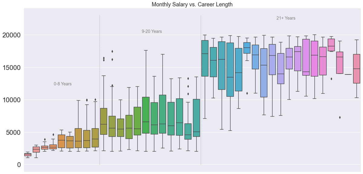
Box Plots for Income Groups
This graph was created for an assignment in a data visualization class.

I will give details about the graph and then as usual I will discuss the code used to generate it.
Salary by Work Experience
The data for this graph was taken from the IBM HR Analytics Employee Attrition & Performance dataset located here.
This graph shows a box plot distribution of salary for cohorts specified by years of work experience. There are clear increases in salary amount at years 9 and 20, and the graph is designed in such a way that it visually highlights these salary increases.
Code Breakdown
Imports
import pandas as pd
import numpy as np
import matplotlib.pyplot as plt
import seaborn as sns
from matplotlib.ticker import MultipleLocator
Code Chunk
#Initialize graph
sns.set(font_scale=1)
fig, ax = plt.subplots(figsize=(20,10))
sns.boxplot(x="TotalWorkingYears", y="MonthlyIncome", data=df)

#adjust major and minor tick marks on the x axis
ax.xaxis.set_major_locator(MultipleLocator(10))
ax.tick_params(axis='x', which='minor', direction='out')
ax.xaxis.set_minor_locator(MultipleLocator(1))

#put dividing lines
plt.plot([8.5, 8.5], [0, 23000], lw=1, color='grey', linestyle=":")
plt.plot([20.5, 20.5], [0, 23000], lw=1, color='grey', linestyle=":")

#add text to groups
ax.annotate('0-9 Years',
            xy=(3, 1),  xycoords='data', fontsize=14,
            xytext=(.09, .55), textcoords='axes fraction',
            horizontalalignment='left', verticalalignment='top', color='grey'
            )
ax.annotate('10-20 Years',
            xy=(3, 1),  xycoords='data', fontsize=14,
            xytext=(.35, .87), textcoords='axes fraction',
            horizontalalignment='left', verticalalignment='top', color='grey'
            )
ax.annotate('21+ Years',
            xy=(3, 1),  xycoords='data', fontsize=14,
            xytext=(.75, .95), textcoords='axes fraction',
            horizontalalignment='left', verticalalignment='top', color='grey'
            )
#get rid of unnecessary labels
ax.set(xlabel="", ylabel='')
ax.get_xaxis().set_visible(False)

#set title
plt.title("Monthly Salary vs. Career Length", fontdict ={'fontsize':18})
Section Breakdown
#Initialize graph
sns.set(font_scale=1)
fig, ax = plt.subplots(figsize=(20,10))
sns.boxplot(x="TotalWorkingYears", y="MonthlyIncome", data=df)
This portion initializes the graph. Seaborn is first called to set the font scale to 1; as-is it does nothing to the graph but changing it to other values adjusts the size of the x-axis labels.
The figure and axis objects are created with plt.subplots, and the figure size is specified. Finally, a boxplot is created using seaborn, with x and y axes specified.
#adjust major and minor tick marks on the x axis
ax.xaxis.set_major_locator(MultipleLocator(10))
ax.tick_params(axis='x', which='minor', direction='out')
ax.xaxis.set_minor_locator(MultipleLocator(1))
This section makes adjustments to the major and minor tick marks. You may notice that there is no x-axis on this graph; it is removed at a later step. I frequently re-use code in my graphs and this section consistently adjusts x-axis parameters, so I will explain it.
Each line modifies the x-axis on the ax object that was created in the section above. The set_major_locator and set_minor_locator methods detect where the tick marks should be located on the graph, and also specify tick spacing at 10 for major ticks and 1 for minor ticks.
The tick_params line makes adjustments for the direction that the tick marks face on the graph (if there were an x-axis shown). In this case the minor tick marks are set to point outwards from the figure.
#put dividing lines
plt.plot([8.5, 8.5], [0, 23000], lw=1, color='grey', linestyle=":")
plt.plot([20.5, 20.5], [0, 23000], lw=1, color='grey', linestyle=":")
This section of code draws the grey dotted lines between each group. These lines serve to break up the portions of the graph so that it is immediately visible to the viewer where the salary breaks occur.
The pyplot.plot method is called, and then there are some numbers. These numbers specify the coordinates of the endpoints of each line on the plot: the first two numbers are x-axis coordinates and the final two numbers are y-axis coordinates; in this case the lines are drawn after 8 years and after 20 years (the extra 0.5 is added to draw the line between boxes rather than on top of them).
Other parameters are specified in this section: the color of the lines is set to grey and the lines are dotted with “:”.
#add text to groups
ax.annotate('0-8 Years',
            xy=(3, 1),  xycoords='data', fontsize=14,
            xytext=(.09, .55), textcoords='axes fraction',
            horizontalalignment='left', verticalalignment='top', color='grey'
            )
ax.annotate('9-20 Years',
            xy=(3, 1),  xycoords='data', fontsize=14,
            xytext=(.35, .87), textcoords='axes fraction',
            horizontalalignment='left', verticalalignment='top', color='grey'
            )
ax.annotate('21+ Years',
            xy=(3, 1),  xycoords='data', fontsize=14,
            xytext=(.75, .95), textcoords='axes fraction',
            horizontalalignment='left', verticalalignment='top', color='grey'
            )
This section adds the labels for each group.
The annotate method is called on the axis object, which relates coordinate positions to values on the axis. The text to be drawn is specified.
After this, an xy variable is specified at (3,1). Annotate has a built-in feature to draw an arrow alongside the text, and this variable specifies the endpoint of said arrow. This part of the code is necessary, but the portion that draws the arrow is removed.
The font size is then set, followed by the text coordinate values (x followed by y). After that, textcoords specifies how the annotate function should read the coordinate values; in this case, as a fraction of the axes. The text was positioned manually through trial and error.
Finally, the horizontal alignment, vertical alignment, and color are specified. The alignment values help determine the positioning of the text; for each text box in this instance, the coordinates specify the location of the top left corner.
#get rid of unnecessary labels
ax.set(xlabel="", ylabel='')
ax.get_xaxis().set_visible(False)
This section of code removes the axis labels and the x axis. This was done because all the information needed to read the graph is currently present in the title, the values on the y-axis, and the group labels.
The set method sets the xlabel and ylabel to blank values. For the second line, ax.get_xaxis() grabs the x axis as an object, and then .set_visible() sets the visibility to false.
#set title
plt.title("Monthly Salary vs. Career Length", fontdict ={'fontsize':18})
The final line in the code chunk sets the title for the graph.