AAPL Stock Ticker and GGAnimate
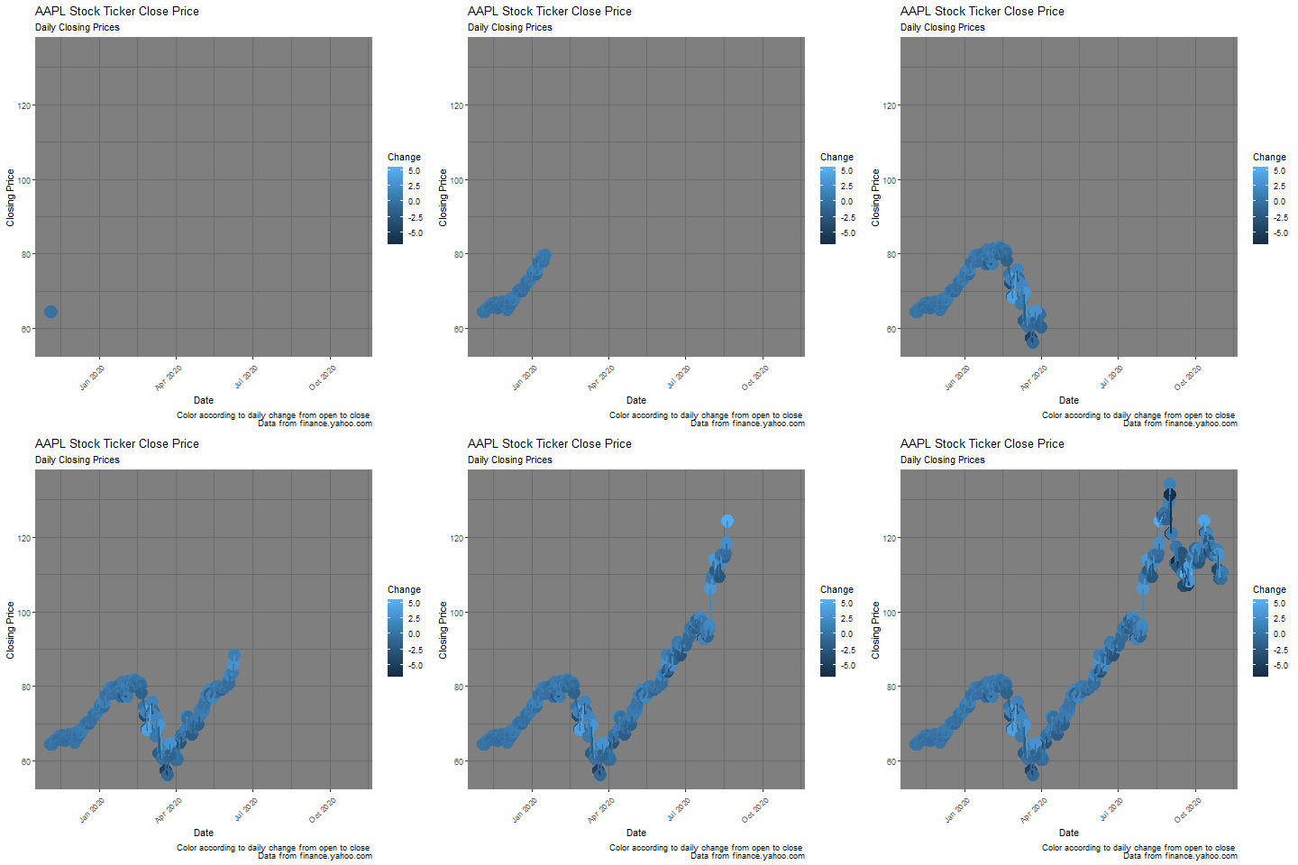
A graph of Apple’s closing prices from 2019 to 2020, animated using the GGAnimate package.

This graph was done as part of an exercise in learning how to use the GGAnimate package. The data was downloaded as a .csv file from finance.yahoo.com.
This graph is comprised of a number of layers detailing the daily closing prices of the AAPL stock ticker from the past year. Each point represents a day (the stock market is closed on weekends and holidays) and a line graph connects each of the points. The colors are mapped to that day’s change in stock price, represented by close price minus open price in USD.
The .gif’s layers were then generated using the GGAnimate package and assembled by gifski.
Code Walkthrough
To recreate the graph, I begin by importing packages used in the plotting process.
#install.packages("gganimate")
#install.packages("ggplot2")
#install.packages("tidyverse")
#install.packages("png")
#install.packages("gifski")

library("gganimate")
library("ggplot2")
library("tidyverse")
library("png")
library("gifski")
It is always a good idea to check your variable types. It is especially important in this case because of the way GGAnimate handles creating the frames of the .gif: it requires any timeseries data to be in ‘Date’ format. But R imports the Date column as a factor, so that needs to be changed. The Change variable also needs to be created so that there is something to map the colors to.
Below is the code to make it happen, captain.
df$Change = df$Close-df$Open
df$Date = as.Date(df$Date)
str(df)
'data.frame': 253 obs. of 8 variables:
$ Date : Date, format: "2019-11-04" ...
$ Open : num 64.3 64.3 64.2 64.7 64.7 ...
$ High : num 64.5 64.5 64.4 65.1 65.1 ...
$ Low : num 63.8 64.1 63.8 64.5 64.2 ...
$ Close : num 64.4 64.3 64.3 64.9 65 ...
$ Adj.Close: num 63.7 63.7 63.7 64.4 64.6 ...
$ Volume : int 103272000 79897600 75864400 94940400 69986400 81821200 87388800 102734400 89182800 100206400 ...
$ Change : num 0.0425 0.02 0.1175 0.1725 0.3625 ...
Building the Graph
Now that the Date column is in the correct format, the graph can be created. I will walk through the code line by line, and the complete graphing block will be shown at the end.
capt1 = "Color according to daily change from open to close \n Data from finance.yahoo.com"This sets the caption, which is located in the lower right corner of the graph.
#initiate graph
graph <- ggplot(df, aes(x = Date, y = Close, color=Change)) +
This line initiates the graphing block with ggplot. It stores the graph data to the graph variable, specifies the dataframe, specifies where to find the X and Y data within the dataframe, and maps the colors on the graph to the Change variable that was created above. Note the + sign at the end of the line, which tells R that whatever code comes next is part of the graph variable.
  #geometries
  geom_point(aes(group = seq_along(Date), size=2)) +
  geom_path(aes(size=1)) +
This next block of code creates the geometries for the graph. First a geom_point() is created. The code within the aes() call sets the size of the points to larger than usual; this is a personal preference to make it easier to see the points on the background. It also specifies that each point is part of its own group. This is necessary because of how GGAnimate creates .gifs: it plots single points on a graph and saves each of those images as a .png file. If the points were not part of their own groups, each frame would only contain a single point and the rest of the points would not be retained between frames.
A geom_path() is also created, and it was set at a size of 1 so that it doesn’t overpower the graph.
  #set theme and background
  theme_dark() +
  theme(axis.text.x = element_text(angle = 45, hjust = 1))+
  guides(size=FALSE)+
The theme and background are then specified. I wanted a dark background for this plot so I set the theme to theme_dark(). Then I wanted to adjust the text elements on the axes, so there is a theme(axis.text.x=element_text()) call to do that. If a custom background color is desired, that can be set by adding panel.background = element_rect(fill=’#colorcode’) right after element_text() (note that a theme, such as theme_dark, must be specified in order to set a custom background). Lastly, an additional legend is generated because two different sizes are specified. guides(size=FALSE) removes this legend.
  #set labels
  labs(title='AAPL Stock Ticker Close Price',
       subtitle="Daily Close Prices",
       caption=capt1,
       x="Date",
       y="Closing Price")
My favorite part, specifying the labels. It is important for maximum impact that labels convey rich meaning while being unobtrusive. capt1 is called and inserted in the lower right, and other labels are manually set.
Animating the Graph
Now that the graph is created, we can use GGAnimate to turn it into a gif.
#Create an animation object
anim = graph + transition_reveal(Date)

#Display the animation object
anim
An animation object anim is specified. The graph is layered with transition_reveal() based on Date (the X axis), which calls GGAnimate and generates each frame of the graph. Finally anim is called and this causes two things to happen: GGAnimate first saves each frame as a .png file, and then gifski is used to render the .png files into a single .gif file. In R Studio, the gif is displayed in the Viewer panel and can be saved by right-clicking and selecting “Save Image.”
Full Code Block
capt1 = "Color according to daily change from open to close \n Data from finance.yahoo.com"

#initiate graph
graph <- ggplot(df, aes(x = Date, y = Close, color=Change)) +

  #geometries
  geom_point(aes(group = seq_along(Date), size=2)) +
  geom_path(aes(size=1)) +

  #set theme and background
  theme_dark() +
  theme(axis.text.x = element_text(angle = 45, hjust = 1))+
  guides(size=FALSE)+

  #set labels
  labs(title='AAPL Stock Ticker Close Price',
       subtitle="Daily Close Prices",
       caption=capt1,
       x="Date",
       y="Closing Price")

#Create an animation object
anim = graph + transition_reveal(Date)

#Display the animation object
anim